How to Style a Small Bedroom Like a Designer Without Spending a Fortune
Disclosure
This post may contain affiliate links. If you purchase through these links, I may earn a small commission at no extra cost to you. As an Amazon Associate I earn from qualifying purchases.
Most expensive-looking bedrooms don’t contain expensive furniture. They feel expensive because the person who styled them understood a few core principles: proportion, texture, layering, lighting, color repetition and restraint.
Once you understand those principles too, the price of individual pieces matters a lot less than how they’re put together.
This guide breaks down exactly what designers do and why each decision works, so you can apply the same logic to your small bedroom at whatever budget you’re working with.
1. Start With a Calm Color Palette
The reason designer bedrooms feel so serene is almost always the color palette. Not because the colors are boring, but because they’re intentional.
Warm neutrals as a base, one or two accent colors that repeat throughout the room, and nothing that fights for attention.
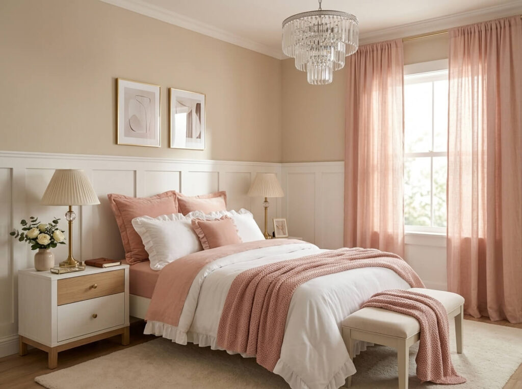
The repetition part is what most people miss. When the same dusty sage appears in the pillow covers, in a small vase on the nightstand and in the throw blanket at the foot of the bed, the eye reads the room as cohesive rather than assembled. That cohesion is what reads as expensive. Mixing six different colors, even beautiful ones, reads as busy regardless of how good the individual pieces are.
Warm neutrals, creams, taupes, warm whites and soft beiges, are the most forgiving base for a bedroom because they reflect light and make a small room feel more open. If you want to add personality, one accent color is enough. Repeat it in at least three places and let the rest of the room stay calm around it.
2. Invest in Better Bedding Before Anything Else
The bed takes up 60 to 70 percent of the visual space in most bedrooms. Whatever budget is available, the bedding is where the most impact per dollar lives.
A beautiful bed in front of bare walls still looks better than a neglected bed in a beautifully decorated room.
The designer approach to bedding isn’t about thread count or brand names. It’s about layering.
A white or neutral comforter as the base, a quilt or lightweight blanket folded back at the top third to show contrast, two Euro square pillows behind the sleeping pillows, and a textured throw folded loosely at the foot. Each layer adds something: volume, texture, color, depth. The bed looks like it took effort even though the individual pieces are simple.
The chunky knit throw is the layer that does the most visual work for the least money. The texture reads as luxurious in a way that a smooth fleece or a basic cotton throw simply doesn’t, because the three-dimensional weave catches the light and adds shadow. A good chenille or chunky knit throw on even a basic bed setup elevates the whole composition significantly. The Lagraty Chunky Chenille Throw Blanket is a good example of this: the handmade crochet quality gives it a dimensional warmth that photographs beautifully and feels genuinely luxurious against the skin.
3. Layer Different Textures Instead of Buying More Things
A room with five different textures and twenty items feels more considered than a room with one texture and fifty.
Texture is the tool designers use to create visual richness without visual noise, and it works because the eye reads variation in surface quality as depth and sophistication.
The specific textures that work best together in a bedroom are the ones that sit at opposite ends of the tactile spectrum: something smooth, something nubby, something soft, something with visible structure.
A linen pillow cover beside a velvet cushion beside a bouclé throw creates that kind of variation without any of them competing for attention because they’re all operating at different frequencies of texture.
The rug is the largest textured surface in the room after the bed and one of the most impactful single additions available. A plush shaggy rug underfoot changes the acoustic quality of the room, adds warmth, defines the sleeping zone and makes bare feet feel like a small daily pleasure. The Junhejiamei faux fur shaggy bedroom rug for example achieves the plush quality that reads as expensive without requiring a significant investment, particularly effective under the bed where it softens the space between the bed frame and the floor.
4. Use Warm Lighting to Make Materials Come Alive
This is the principle that makes the biggest immediate difference and gets skipped most often.
Cool white or daylight lighting drains warmth from every material it touches: velvet looks flat, brass looks harsh, wood looks yellow in the wrong way, and skin tones look washed out.
Warm white lighting in the 2700K range does the opposite. It deepens velvet, enhances brass, softens wood and makes the whole room feel like somewhere that’s genuinely worth spending time.
The other thing warm lighting does is create depth through shadow.
A single overhead light flattens everything in the room by illuminating it all at the same intensity. Multiple warm light sources at different heights, a bedside lamp, a small floor lamp in a corner, a string of warm lights above the headboard or a chandelier overhead, create pools of light separated by shadow that make the room feel larger and more considered.
A bedside lamp with a warm, adjustable glow is one of the most important single purchases in a bedroom because it’s the light that’s actually on for most of the evening. The Lepower adjustable brass desk lamp works well here because the brass finish contributes to the warm metallic palette and the adjustable arm means the light direction can be positioned exactly where it’s needed. For a softer ambient option, an option like the Dawnwake mushroom table lamp has a sculptural quality that makes it look like decor and a light source at the same time, which is exactly the kind of dual-function detail designers lean into.
For a room that wants something overhead with presence, a crystal chandelier adds a focal point that changes how the ceiling reads and casts small reflections across the walls when the light is on. The LaLuLa crystal chandelier with warm candle-style bulbs suits a feminine or romantic bedroom aesthetic and installs without structural changes in most standard bedrooms.
5. Mix Metals Carefully
Matching all the metal finishes in a room, every lamp in gold, every handle in gold, every mirror frame in gold, produces a result that looks coordinated but somehow flat.
Mixing metals intentionally, gold with a touch of black, or brass with a hint of aged bronze, is what gives a room the layered quality that reads as designed rather than assembled from a matching set.
The rule is to let one metal lead and use a second in smaller doses as an accent.
Warm metals, gold and brass, work naturally together in a bedroom because they both enhance the warm tones of the palette. Adding one black element, a lamp base, a mirror frame, a curtain rod, creates a grounding contrast that stops the room from feeling too sweet or too uniform.
A mirrored decorative tray on the vanity or nightstand serves two purposes. It groups small items like perfume and candles into a composed vignette, and the reflective surface adds another layer of light movement to the room. The Feyarl mirrored cosmetic organizer tray is the kind of piece that looks more expensive than it is because mirrored surfaces read as deliberate and polished in a way that plain trays don’t.
6. Style Surfaces Like a Vignette, Not a Shelf
The nightstand is one of the most visible surfaces in the bedroom and one of the most consistently misused.
Most people treat it as a landing pad for whatever arrives at bedtime: the phone, a half-finished glass of water, a charging cable, three books, some lip balm.
What designers do instead is treat it as a small composition.
The formula that works on almost any surface is: something tall, something low, something organic, something that catches light.
A lamp as the tall element, a small stack of books as the mid-height element, a single stem in a ceramic bud vase as the organic element, and a small candle or a decorative object as the light-catching element. Four things, intentionally placed, looks more finished than fourteen things arranged without thought.
The same principle applies to the vanity and the dresser. A decorative mirrored tray like the Hipiwe vanity tray confines the perfume and a candle into a composed unit that looks styled on the dresser top rather than scattered. The tray is what makes the difference between items that sit on a surface and items that belong there.
Artificial flowers done well are another designer surface tool worth taking seriously. The quality range in faux florals has improved significantly, and the right arrangement in a ceramic or glass vase contributes the organic element that every styled surface needs without the maintenance of keeping fresh flowers alive. For example, the FiveSeasonStuff artificial floral arrangement and the Wlgranjia ceramic vase work together as a ready-made surface composition that reads as both intentional and alive.
7. Hang Curtains Higher and Wider Than Feels Right
Curtains hung at the exact height of the window frame make the window look small and the ceiling feel low. Curtains hung a few inches below the ceiling and extending several inches beyond the window frame on each side make the window look larger, the ceiling feel higher and the whole room feel more proportional.
This is one of the most impactful changes available in a bedroom because it costs nothing extra and requires no additional furniture or decor.
The length matters equally.
Curtains that fall exactly to the windowsill look deliberate in the wrong way, too precise for a bedroom. Curtains that reach the floor, ideally with a small puddle or at least grazing the floor, look architectural and considered in a way that shorter curtains rarely do.
When in doubt, always go longer and higher than instinct suggests.
In a small bedroom, sheer or light curtains in a neutral tone are often better than heavy drapes because they maintain the light while still framing the window.
The goal is to make the window feel like an intentional architectural feature rather than just a hole in the wall.
8. Choose One Statement Piece Instead of Ten Mediocre Ones
The budget mistake most people make in a bedroom is spreading the money evenly across many mid-range pieces, ending up with a room that’s cohesive but lacks personality.
The designer approach is to identify the one piece the room is going to be built around and invest in that, then let everything else be simpler and less expensive around it.
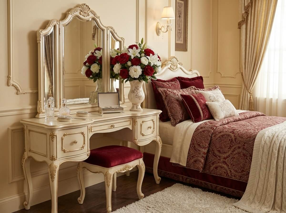
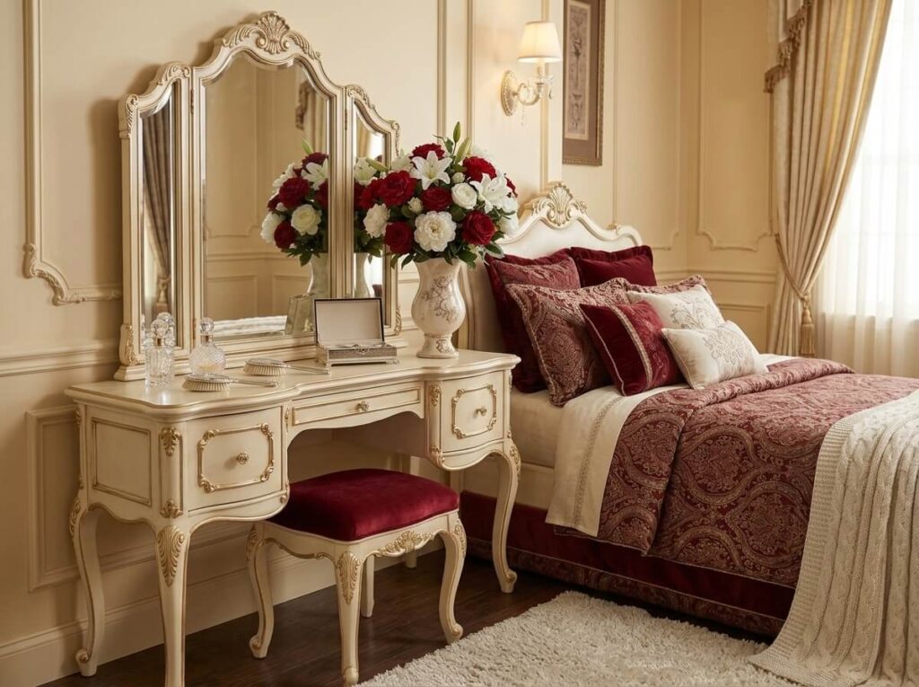
A velvet upholstered headboard is the most impactful single statement piece available in a bedroom because it’s the first thing the eye goes to when entering the room and it changes how the whole bed reads. An elegant vanity in the corner with a good mirror transforms a corner that would otherwise be storage into a proper dressing area. A beautiful chair adds a seating element that signals the room was thought about as a space to be in, not just to sleep in.
If a vanity is the statement piece you’re building toward, the post on Small Bedroom Vanity Ideas That Feel Luxurious show how to create a designer focal point without sacrificing space.
9. Make Clutter Invisible and Embrace Negative Space
Luxury hotel rooms feel spacious and calm partly because of what isn’t in them.
No visible cables, no random items on surfaces, no storage that draws attention to itself. The deliberate emptiness, the negative space, is as much a design decision as the things that are present.
In a small bedroom, achieving that requires storage that hides things rather than contains them.
Drawer organizers that keep the inside of drawers as composed as the outside. Under-bed storage that handles the bulk items that would otherwise live in visible stacks.
A rolling cart that consolidates the miscellaneous daily-use items and can be tucked out of sight. The more that gets hidden, the fewer items are visible, and the more the items that are visible get to be intentional. Check out more ideas on how to style and use the rolling cart around the house: 13 Brilliant Rolling Cart Ideas for Small Spaces That Actually Keep You Organized
The one-clear-surface rule is the simplest way to maintain the negative space principle on a daily basis. Choose one surface in the room and commit to keeping it completely empty.
That single clear area gives the eye somewhere to rest and makes the whole room feel calmer than it would if every surface were occupied.
For the specific storage solutions that keep a small bedroom looking uncluttered, the post on small bedroom storage ideas for tight spaces covers every zone of the room with the same principle applied throughout.
10. Scale and Proportion Matter More Than Price
This is the principle that explains why some rooms with expensive furniture still look wrong and some rooms with budget pieces look genuinely beautiful.
Scale is the relationship between the size of each piece and the size of the room. Proportion is the relationship between pieces relative to each other.
When both are right, the room feels balanced. When either is off, the room feels unsettled regardless of the quality of the individual pieces.
A nightstand that’s too small for the bed looks like an afterthought even if it’s well made. A lamp that’s too short for the nightstand gets lost visually. A rug that doesn’t extend beyond the sides of the bed makes the bed look like it’s floating rather than anchored. Curtains that barely clear the windowsill. These are scale issues, and they’re what experienced designers check first when a room feels off without an obvious reason.
The practical version of this principle is to always size up rather than down on rugs, curtains and artwork.
All three are almost universally undersized in most bedrooms because people are cautious about committing to something large. The oversized version of all three almost always looks more intentional than the conservative one.
11. Finish With Something Living
Designer rooms almost always include something organic, a plant, fresh flowers, a branch in a vase, dried botanicals.
The reason is that living or natural elements break up the visual regularity of furniture and textiles in a way that no manufactured object can. They introduce an irregular, organic shape into a space defined by straight lines and right angles, and that contrast makes everything around them look more intentional.
Fresh flowers are the strongest version of this because they change over time, which signals the room is lived in and cared for rather than staged. A small pothos on a floating shelf or a trailing plant beside the vanity adds the same quality with no weekly replacement required.
When fresh flowers aren’t practical, a quality faux arrangement in the right vase achieves the same visual result. The vase matters as much as what’s in it. A ceramic or glass vase with a considered shape reads as styled. A plastic container or a basic cylindrical vase makes even beautiful flowers look like an afterthought.
Mistakes Designers Never Make
Tiny lamps beside a large bed are one of the most consistent proportion errors in bedrooms. The lamp should be roughly the same height as the top of the headboard when sitting on the nightstand. A lamp that’s significantly shorter than that disappears visually and lights the wrong part of the room.
Ceiling-only lighting as the sole source in a bedroom makes the space feel like a waiting room regardless of how warm the bulb is. Multiple light sources at different heights are what create the depth and warmth that make a bedroom feel like a place worth lingering in.
Furniture pushed against every wall is the layout mistake that makes rooms feel like they’re trying too hard to maximize floor space. Pulling furniture slightly away from the wall, particularly the bed, creates a sense of breathing room that paradoxically makes the room feel larger rather than smaller.
Matching everything, every piece from the same collection, every pillow the same color, every finish identical, produces a result that looks assembled rather than designed. Intentional variation, different textures in the same tone, slightly different shades of the same color, one contrasting element in an otherwise cohesive palette, is what creates the layered quality that reads as intentional.
Finally, ignoring scale undermine the individual quality of each piece involved.
The Logic Behind Small Beautiful Rooms
Beautiful bedrooms aren’t expensive. They’re logical. Every decision serves the palette, the proportion or the layering. Color repeats. Textures contrast. Light is warm and comes from multiple sources. Clutter is hidden. Scale is respected. One piece earns the room’s attention and everything else supports it.
Start with the bed, since it’s the majority of what the room shows, and work outward from there. Get the lighting right early because it affects how every other decision looks. Choose one accent color and repeat it rather than introducing new colors to solve styling problems. And leave some surfaces empty, because the space around the objects is part of what makes the objects look good.


